CALIBRATION SYSTEM DASHBOARD
Project Overview
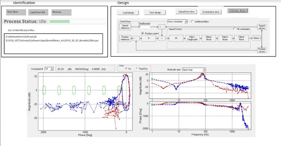
Redesign of the GFT Tuner Software, a calibration system dashboard for missile engine tuning. The legacy product had evolved through ad-hoc patches over more than a decade, creating a fragmented and inconsistent interface. The project’s goal was to prepare the system for commercialization to defense-sector clients by conducting in-depth research, restructuring the user experience, and delivering a conceptual UI proposal that modernized the product while respecting its operational complexity.
Domain & Market Research
The first challenge was to understand an entirely unfamiliar domain: missile engine calibration systems. To build this knowledge, I conducted:
-
Workshops with engineers who had developed and maintained the legacy platform.
-
Sessions with hardware and software specialists to map workflows, constraints, and technical logic.
-
Benchmarking of design patterns in aerospace, defense, and industrial control systems, where usability, reliability, and error prevention are critical.
This process provided a clear picture of the system’s capabilities, workflows, and weak points, and highlighted opportunities for improvement.
User Research & Pain Points
To validate needs and identify usability challenges, I conducted interviews and usability testing sessions with system engineers, calibration operators, and test staff.
Key Pain Points in the Legacy Dashboard:
-
Features scattered across multiple panels with no clear hierarchy.
-
Steep learning curve — weeks of training required for new operators.
-
High cognitive load due to inconsistent terminology and cluttered screens.
-
Limited visibility into calibration progress and system status.
User Insights:
Operators required efficiency, transparency, and error prevention. They needed the system to provide immediate clarity, reduce training time, and support both experienced and novice users.

Empathy Map
Says
-
“It takes too long to find the right control.”
-
“I need to be sure I won’t make a mistake
Does
Navigates across multiple panels, cross-checks data manually, relies on engineers for guidance.
Pains
Fragmented navigation, poor hierarchy, high error risk
Thinks
-
“Is the system responding correctly?”
-
“Am I tuning the right parameter
Feels
Overwhelmed, anxious about errors, relieved when feedback is clear
Gains
Logical structure, real-time feedback, reduced training time, consistent interaction patterns
UX Process & Information Architecture
Based on research findings, I redefined the system’s information architecture:
-
Grouped related functions into logical modules.
-
Organized workflows into clear sequences (setup → calibration → results).
-
Prioritized essential functions to reduce clutter and cognitive load.
I created low-fidelity wireframes and refined them through iterative feedback loops with engineers and operators. This process ensured alignment between user needs and technical constraints before moving into UI exploration.

User Testing & Validation
Concept screens and prototypes were tested with both experienced and novice operators in simulation environments.
-
Experienced users reported easier navigation and improved task flow.
-
New users highlighted shorter learning curves, with reduced training requirements.
-
Feedback shaped refinements in terminology, component placement, and visual hierarchy.

Project Goals
-
Simplify navigation and reduce operator training time.
-
Increase transparency with real-time feedback and process visualization.
-
Create consistency across components and workflows.
-
Support operators with different experience levels.
-
Provide a market-ready vision for defense-sector clients.
Design Principles
-
Clarity First – Prioritize essential data and reduce cognitive load.
-
Consistency – Standardized modules and patterns for predictable use.
-
Transparency – Immediate system feedback and visible calibration progress.
-
Error Prevention – Safe defaults, clear warnings, and confirmatory actions.
-
Scalability – Flexible structure to support future features.
UI & Visual Design - Conceptual Proposal
The visual stage focused on delivering a conceptual UI proposal rather than a full UI system. The concept aimed to demonstrate how a modernized interface could improve usability, trust, and performance:
-
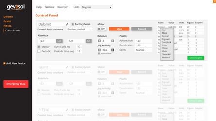
Introduced a centralized dashboard with clear sections and logical navigation.
-
Designed a modern visual language aligned with defense-sector standards for clarity and reliability.
-
Incorporated clear process demonstrations to make calibration stages more transparent.
-
Ensured immediate access to critical actions, minimizing errors and delays.
-
Proposed a dark theme suitable for control-room environments.
This conceptual UI provided stakeholders with a tangible vision of how the product could evolve, accelerating discussions and aligning engineers, business partners, and design teams around a shared direction.

Key Takeaways
-
Transformed a decade-old patchwork system into a cohesive, research-driven UX concept.
-
Reduced training complexity and improved confidence for both novice and expert operators.
-
Delivered a conceptual UI proposal that introduced a modernized visual language, centralized dashboard, and process clarity.
-
Provided stakeholders with a validated design direction that balances usability, performance, and operational constraints.


