Designing with AI:
A Full Journey
From Idea to Product in 04:38 Hours
In this challenge, I set out to design and build a complete app concept in less then five hours, using AI to compress what is normally days and weeks of work, into a single, focused sprint.
The process demonstrates my ability to think strategically, adapt quickly, and leverage cutting-edge tools to deliver a user-centered product with both speed and quality, skills directly transferable to fast-paced, high-impact projects.
AI Tools: ChatGPT-5 | Perplexity | GenSpark.ai | NotebookLM | UX Pilot
From Research to Concept:
Designing a Cross-Platform Sports Watch Companion App
As an endurance athlete and a product designer, I use sports watches and their companion apps daily to monitor, analyze, and improve my performance. Over the years, I have trained and raced with different platforms, each packed with advanced capabilities. Yet, I have repeatedly run into the same usability hurdles: overly complex navigation, hidden features, and data that is powerful but not surfaced when needed.
The purpose of this research is not only to understand the current market and user pain points, but also to transform these insights into the foundation for a new, cross-platform application. This app will be designed to deliver meaningful value to users of any sports watch brand, by providing smarter data analysis, actionable insights, and more intuitive ways to interact with their performance information.
Market & User Research
In-depth market analysis, competitive benchmarking, and a deep understanding of user needs
prompt
Conduct a comprehensive research process for sports watch companion apps, combining both user research and market analysis to inform the design of a cross-compatible sports data application.
-
User Research – Identify real user pain points, unmet needs, and key motivations for using sports watch apps, with special attention to non-technical users. Map out user segments, usage patterns, and behavioral trends.
-
Market Research – Analyze leading apps (Garmin, Coros, Apple, Suunto) and Strava as an aggregator. Compare shared features, unique differentiators, and innovation gaps, noting underutilized capabilities and areas where UI/UX creates friction.
-
Personas – Develop 3–4 detailed personas based on findings, including demographic details, fitness levels, preferred devices, goals, challenges, and emotional drivers for engaging with fitness technology.
The outcome should clearly highlight opportunities for innovation and guide the design direction for a solution that maximizes usability, accessibility, and engagement across diverse user groups.
Market Research Overview
I focused on five leading platforms: Garmin Connect, COROS (including Training Hub and EvoLab), Apple (watchOS 11 with Fitness & Vitals), Suunto (Suunto app), and Strava. The analysis concentrated on:
-
Core features common to all
-
Unique differentiators of each
-
Data presentation and visualization
-
Added value beyond standard tracking
-
Pain points reported by users
The research combined official product documentation with independent reviews and community discussions to ensure an accurate and balanced view.
Competitive Landscape – Feature Comparison
Common Features Across All Apps
All provide workout synchronization, activity logs, GPS tracking, heart rate/pace/distance metrics, maps and route planning, trend analysis, and sharing capabilities.
Differentiators
-
Garmin Connect – Rich performance metrics: Training Readiness, Body Battery, Training Status, Garmin Coach plans, and motivation via challenges/badges. Recently added Connect+ with exclusive features.
-
COROS – EvoLab for race prediction, Running Fitness, load/fatigue; Training Hub for advanced planning and coach collaboration; many features are free.
-
Apple (watchOS 11) – Training Load integrated with Vitals and the Activity app, showing 7-day vs. 28-day averages; seamless UX across Apple devices.
-
Suunto app – Outdoor/adventure focus: 2D/3D maps, sport-specific Heatmaps, route planning, and SuuntoPlus “mini-apps.”
-
Strava – Social-driven - Segments, leaderboards, clubs, Beacon live location sharing, plus advanced analytics like Relative Effort and Fitness & Freshness (premium).
User-Reported Pain Points
-
Complexity & navigation friction – Particularly in Garmin and Suunto, where flows can be unintuitive or inconsistent.
-
Minimal UI in some apps – COROS app is sometimes described as powerful in data but minimal in interface design.
-
Subscription tension – Strava places key analytics behind a paywall; Garmin’s introduction of Connect+ triggered discussions about paying for previously free features.
User Research – Personas & Insights
-
Time-Pressed Parent – Runs 3–4 times/week, needs concise data and actionable suggestions without deep menu navigation.
-
Data-Driven Marathoner – Wants precise load/recovery tracking, advanced analytics, and macro-cycle planning.
-
Community-Motivated Rider – Values leaderboards, club challenges, and social recognition.
-
Trail Explorer – Needs detailed route planning, Heatmaps, and navigation for off-road adventures.
-
Tri-Focused Optimizer – Requires integrated tracking and load management across swim, bike, and run.
Common themes: information overload, under-discovered advanced features, and a need for clearer explanations of why the data matters.
Confirmation of Initial Hypotheses
At the outset of this research, I formed three hypotheses:
-
Most users do not utilize the full range of features – Platforms offer advanced analytics such as Garmin’s Training Readiness and Body Battery, COROS EvoLab, Apple’s Training Load, and Strava’s Fitness & Freshness, but many require setup, interpretation, or subscription, which reduces usage among casual and even committed athletes.
-
The apps are cumbersome, with nested menus – Feedback often highlights unintuitive navigation and inconsistent structures, especially in Garmin and Suunto, making it harder for users to access even essential features.
-
Non-technical users miss important capabilities – Features are often hidden in settings, use specialized terminology, or are locked behind premium tiers, meaning non-expert users underutilize their devices’ potential.
Design Takeaways – Opportunity Areas
-
Surface decisions, not just data – Provide actionable recommendations in plain language (e.g., “Maintain load” or “Back off today”).
-
Improve discoverability of advanced features – Use progressive disclosure and contextual tips to guide users.
-
Streamline navigation – Context-driven dashboards and shortcuts based on activity type.
-
Leverage social and safety features – Expand tools like Strava’s Beacon for peace of mind and motivation.
-
Engaging onboarding with quick, fun questions – Create an intro that asks playful yes/no or short questions about years of running, weekly mileage, number of marathons, frequency of runs, age, weight, and height, in a light, enjoyable way.
-
Post-workout learning feedback – After each workout, the watch shares what it has learned about the user and how it can be helpful moving forward.
-
Feature search bar – Allow direct search for features instead of hiding them in deep, nested menus.
-
Personalized dashboard – Offer a customizable dashboard available both on mobile and desktop.
Empathy Map
Translating research insights into user perspectives, emotions, and motivations
prompt
Create a complete empathy map for the primary target user persona of the new app. Map out what the user says, thinks, does, and feels, including their pains and gains. The map should provide insights into both functional and emotional needs, guiding future design decisions.
1. Say
-
“I just want to see what matters for today’s training.”
-
“I know there’s more data in here, but I can’t find it.”
-
“Why is everything hidden in so many menus?”
-
“Some features are only for premium, I’m not sure if it’s worth paying.”
-
“I wish it was easier to get routes and see my progress without digging.”
2. Think
-
“Am I training the right amount, not too much, not too little?”
-
“These numbers are interesting, but I don’t know what to do with them.”
-
“It would be great if the app understood my habits and suggested workouts.”
-
“Why can’t one app bring together everything from different watches?”
-
“This should be simpler; my time is limited.”
3. Do
-
Check today’s activity summary after a workout.
-
Browse segments, leaderboards, or challenges for motivation.
-
Occasionally look at training load or recovery metrics, but not every time.
-
Search online for explanations of app metrics or training terms.
-
Avoid certain features because they are hard to find or unclear.
4. Feel
-
Frustrated when navigation is complex or when data is hidden.
-
Motivated when competing with friends or seeing progress.
-
Overwhelmed by too many stats without context.
-
Curious about new features, but hesitant to explore if they seem complicated.
-
Disappointed when core features are locked behind subscriptions.
5. Pains
-
Overly nested menus make navigation slow.
-
Valuable insights buried or hard to discover.
-
Lack of personalization across devices.
-
Data without clear, actionable meaning.
-
Fragmentation - needing multiple apps for different brands or features.
6. Gains
-
A single, clear dashboard tailored to their needs.
-
Fun, engaging onboarding that feels personal.
-
Post-workout feedback that teaches them something new.
-
Ability to search for any feature instantly.
-
Unified access to advanced analysis without switching apps.
Product Specifications
& Screen Flow
Defining the product’s structure, features, and detailed screen-by-screen layout
prompt
Translate the research findings into a fully structured UX specification for UX Pilot. Include an introduction screen with playful yes/no questions to personalize the experience, a search function for features, post-workout insights, and a personal dashboard. Define each screen’s layout, hierarchy, key interactive elements, and navigation flow.
Goal:
Provide users of any sports watch brand with a unified, intuitive, and
personalized platform for analyzing, understanding, and acting on their training data. The app will resolve navigation complexity, surface meaningful insights, and adapt to each user’s needs.
1. App Structure & Navigation Hierarchy
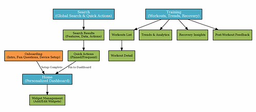
Primary Navigation (Bottom Tab Bar – always visible):
-
Home – Personalized dashboard with widgets, key stats, and quick actions.
-
Training – Detailed view of workouts, training load, recovery, and historical trends.
-
Explore – Routes, community challenges, and leaderboard access.
-
Search – Global search bar for all app features, metrics, and settings.
-
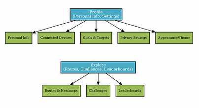
Profile – Personal details, preferences, device connections, and app settings.
Secondary Navigation (Top or contextual menus):
-
Context-based filters (e.g., filter workouts by sport type, date range).
-
Quick links to frequently used features within sections.
2. Onboarding & Intro Experience
Purpose: Gather essential user data while creating an engaging and friendly first impression.
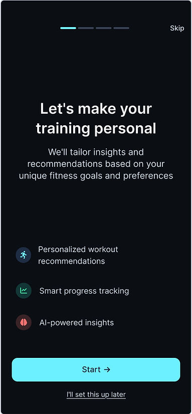
Screen 1: Welcome & Purpose
-
Headline: “Let’s make your training personal”
-
Short intro text explaining the app’s benefit: “We’ll tailor your dashboard, insights, and suggestions to your unique training profile.”
-
CTA button: “Start”
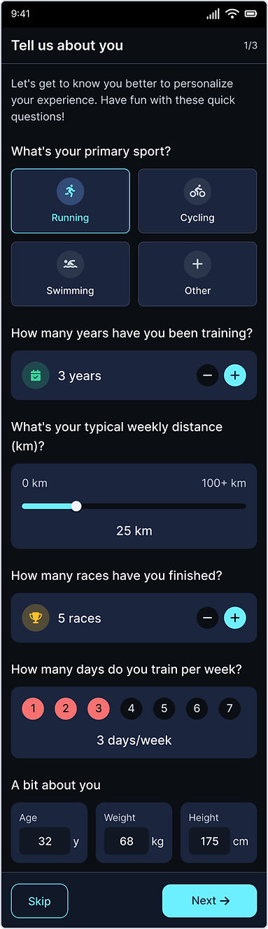
Screen 2: Fun Quick Questions
-
Yes/No toggles and quick number inputs for:
-
Years running/cycling/swimming
-
Weekly average distance
-
Number of marathons or main events completed
-
Typical training frequency (days/week)
-
Age, weight, height (with friendly illustrations/icons)
-
-
CTA button: “Next”
Screen 3: Device & Data Sources
-
List of compatible watch brands and apps with easy connect buttons.
-
CTA button: “Finish Setup”
Behavior:
-
Data populates initial dashboard widgets.
-
Answers influence personalized recommendations from day one.
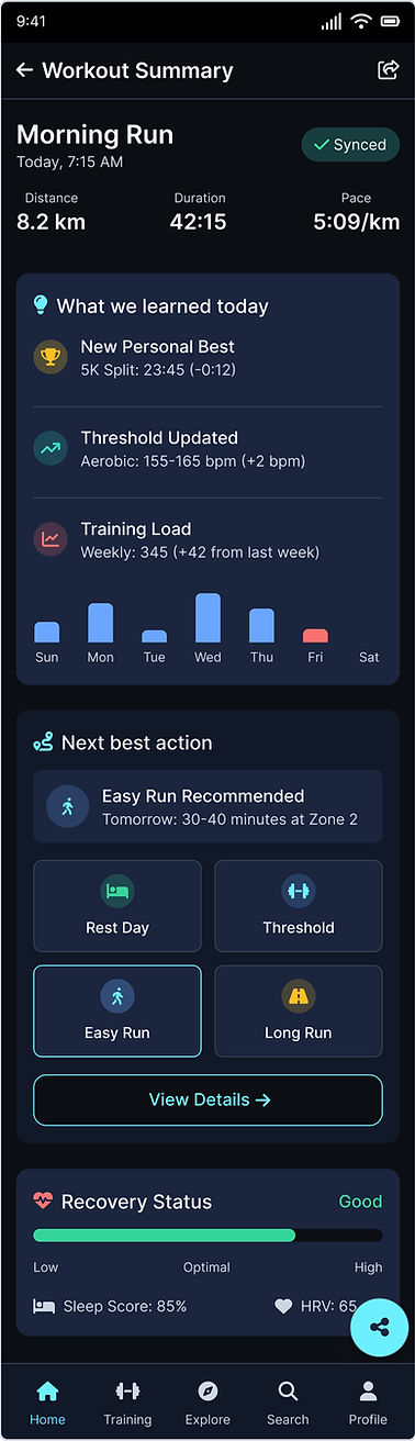
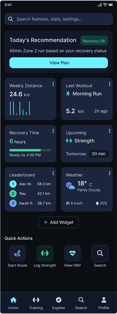
3. Home – Personalized Dashboard
Purpose: One glance at what matters most, tailored to the user’s goals and habits.
Layout:
-
Top Section: Training Readiness / Today’s Recommendation (card with status, reason, and quick link to Training section).
-
Customizable Widgets:
-
Weekly distance & time
-
Last workout summary
-
Recovery time remaining
-
Upcoming training suggestion
-
Leaderboard position / latest segment achieved
-
Weather conditions for planned route
-
-
Quick Actions Row: User-defined actions like “Start route planning,” “Log cross-training,” “View HRV trend,” “Create a workout.”
Interaction:
-
Long-press widgets to remove/rearrange.
-
Add new widgets from the Search screen.
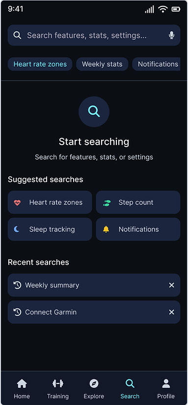
4. Search & Quick Actions Hub
Purpose: Avoid deep menu diving; make all features discoverable.
Search Bar Behavior:
-
Live suggestions as user types:
-
Features (e.g., “Training Load”)
-
Data points (e.g., “VO2 Max”)
-
Actions (e.g., “Plan Route”)
-
Settings (e.g., “Connect Device”)
-
-
Recent searches displayed below.
Quick Actions Area (beneath search results):
-
Frequently used actions pinned by the user or automatically suggested based on usage patterns.
-
Example: “Add strength workout,” “Share activity,” “Check heatmaps.”
Link to Dashboard Customization:
-
Any action or feature found via Search can be pinned directly to the Home dashboard.
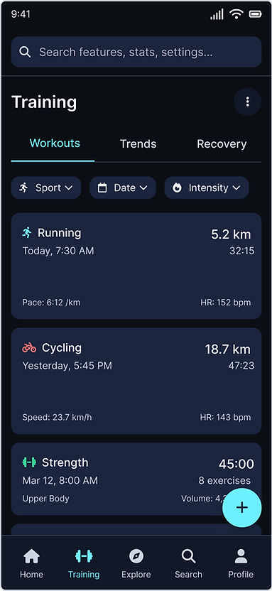
5. Training Section
Purpose: Deep dive into performance and progression.
Subsections:
-
Workouts List View – Filterable by sport type, date, and intensity.
-
Workout Detail – Map, splits, metrics (HR, pace, cadence), zone distribution, and personal notes.
-
Trends – Training load, fatigue, fitness, recovery graphs (7, 28, 90 days).
-
Recovery – Body Battery/HRV trends, sleep integration, suggested rest days.
Actions:
-
Create structured workout (with templates for intervals, long runs, cross-training).
-
Export workout plan to connected devices.
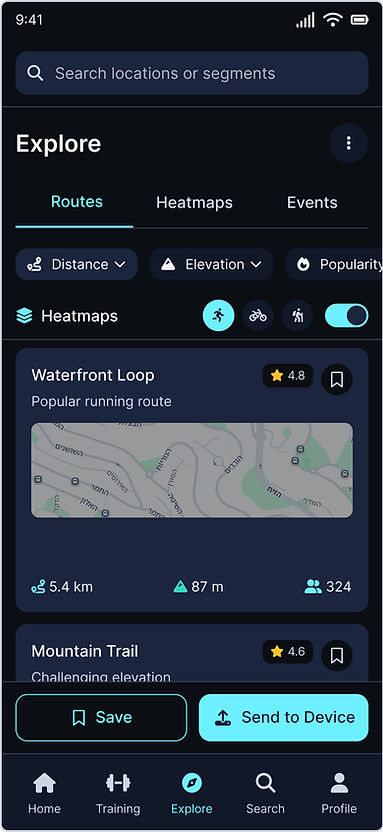
6. Explore Section
Purpose: Community engagement and motivation.
Features:
-
Routes: Discoverable by location, sport type, distance, elevation, popularity.
-
Heatmaps: Sport-specific, to highlight popular paths.
-
Challenges: Join branded or community challenges (with badges/rewards).
-
Leaderboards: By segment, distance, or custom metric.
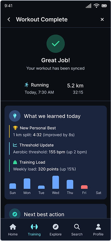
7. Post-Workout Feedback Flow
Trigger: Immediately after syncing a completed workout.
Content:
-
Headline: “Here’s what we learned from today’s session.”
-
Summary of new personal records, training load changes, recovery impact.
-
Recommendation for the next workout or rest period, with rationale.
-
Optional link to related tips or articles.
UI:
-
Card format with 2–3 concise points, swipeable if multiple insights.
8. Profile & Settings
Purpose: Manage personal details, device integrations, preferences.
Sections:
-
Personal info (editable)
-
Connected devices & apps
-
Goal setting (distance, events, fitness targets)
-
Privacy & sharing settings
-
Appearance/theme selection
9. Cross-Device Experience
-
Mobile App: Primary interaction for daily use, quick checks, and workouts.
-
Web App: Extended analytics, larger dashboard view, in-depth trend analysis, and route planning.
-
All personalization syncs across platforms.
10. Key Design Considerations
-
Hierarchy: Information and actions are surfaced in order of daily relevance: Today’s status → Key metrics → Insights → Exploration.
-
Buttons & Actions:
-
Primary CTAs are full-width buttons at the bottom of screens (e.g., “Start,” “Finish,” “Add to Dashboard”).
-
Secondary actions as icons or in contextual menus.
-
-
Personalization: Every metric, widget, or quick action can be added/removed from the Home dashboard.
-
Search-Driven Access: Search is central, reducing the need for deep navigation.
-
Consistent Feedback: Visual and textual feedback after every action (e.g., saving a widget, completing a workout).
UI & Visual Language Definition
Exploration of visual styles, color palettes, and typography to set a cohesive design direction
prompt
Conduct an in-depth UI design research process, analyzing color palettes, typography, and visual styles from both competing sports watch apps and other apps appealing to the same target audience. Recommend a pilot-ready color palette, font selection, and component styles that ensure clarity, engagement, and accessibility.
Insights from Benchmarking - Similar Apps
-
Apple Activity / HIG – The Activity rings have a strict color language (Move red, Exercise green, Stand blue) with the guideline to present them on a black background and never alter their colors.
Conclusion: If displaying Apple’s Activity Rings in a cross-brand feature, don’t change the colors and keep them on a black background. -
Garmin Connect – Home screens can be customized (Home “Stay Active”/“Track my Training”), but there is clutter and many submenus.
Recommendation: Implement a personal widget-based dashboard + quick access to favorite features. -
Strava – Strong brand identity with orange (International Orange), social-oriented UI (Segments/Leaderboards).
Conclusion: An energetic accent can be used for actions/achievements, but keep the base neutral to avoid clashing with various watch brands. -
Suunto – Strong emphasis on Heatmaps and 2D/3D maps.
Recommendation: In Explore screens, prioritize map layers and route load visualizations with distinct, high-contrast colors. -
Fitbit (Material You) – Simple 3-tab structure (Today/Coach/You) with light customization for key stats.
Recommendation: Keep navigation short and clear, with a focused “Today” view. -
WHOOP – Uses green/yellow/red for Recovery and blue for Strain.
Recommendation: Use a similar semantic color code for Post-Workout/Recovery states, ensuring accessibility contrast.
Color – Principles & Recommendations
Principles
-
Neutral base environment (bluish-grey or deep blue) + energetic accent for actions/achievements; Light/Dark mode; maintain AA contrast at minimum (normal text 4.5:1, large text 3:1).
-
On Android, consider Dynamic Color (Material You) for OS alignment, but allow override for brand consistency.
-
If showing Apple Activity Rings, don’t change their colors and keep a black background.
Practical Recommendations (with semantic mapping)
-
Primary – main CTAs/actions
-
Secondary – highlights/chips
-
Info / Success / Warning / Danger – state indicators
-
Recovery green; Strain/Load blue or orange depending on context
Typography – Principles & Recommendations Principles
-
Base size 16px for readability; iOS: minimum 11pt, support Dynamic Type (up to ~200% scaling).
-
Clear numeric hierarchy for headers/metrics; tabular lining for training metrics (pace/HR).
-
On iOS: consider SF Pro/SF Compact; on Android/Web: Inter/Roboto for wide availability. (UXPilot supports Custom Fonts, so importing is easy.)
Suggested scale (Line-height in brackets)
-
Display 32/40 Semibold
-
H1 28/36 Semibold
-
H2 24/32 Medium
-
H3 20/28 Medium
-
Body 16/24 Regular
-
Secondary 14/20 Regular
-
Caption 12/16 Regular
Iconography
-
iOS: Use SF Symbols (scales/weights/render modes) for consistency with text.
-
Android/Web: Use Material Symbols (FILL/weight/grade variants for states). 24dp grid.
-
Recommendation: Outlined by default; Fill for active/pressed state; stroke weight 1.5–2px; sizes 20/24/32 depending on density.
Buttons, Search, Spacing
-
Primary Button: min height 48px, radius 12px, Semibold label.
-
Secondary Button: outline/quiet style.
-
States: default/hover/pressed/disabled with color/opacity/shadow change.
-
Global Search: persistent search bar with live suggestions (features/data/actions/settings), Pin to Dashboard directly from results.
-
Tap Targets: WCAG 2.2 AA – minimum 24×24 CSS px; AAA/iOS recommended 44×44.
-
Grid: 8pt system (4/8/16/24/32) for consistent spacing; cards/fields radius 12.
Motion & Micro-Interactions
-
Guidelines: use ease-out for entrances, ease-in for exits; avoid linear. Durations: 150–250ms for mobile micro-interactions; +~30% for tablet, −~30% for wearables.
-
Respect Reduce Motion OS setting: remove heavy parallax/animations if enabled.
Accessibility (critical in analytics/maps)
-
Contrast: AA – 4.5:1 normal, 3:1 large; AAA – 7:1. Test all hover/pressed states in both themes.
-
Dynamic Type / Larger Text: allow scaling to 200%+ while preserving usability.
-
Color coding: never rely on color alone, add text/icons.
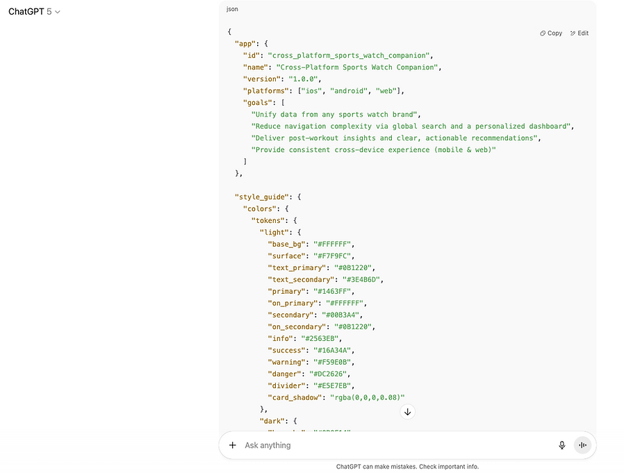
Clean Color Palette
Light
-
Base / Background: #FFFFFF
-
Surface: #F7F9FC
-
On-Surface Text: #0B1220
-
Primary (CTA/Links): #1463FF → On-Primary: #FFFFFF
-
Secondary (Highlights/Chips): #00B3A4 → On-Secondary: #0B1220
-
Info: #2563EB
-
Success (Recovery): #16A34A
-
Warning (Load/Overreaching): #F59E0B
-
Danger (Errors): #DC2626
-
Divider: #E5E7EB
Dark
-
Base / Background: #0B0F14
-
Surface: #111827
-
On-Surface Text: #F3F4F6
-
Primary: #6AA6FF → On-Primary: #0B0F14
-
Secondary: #2DD4BF → On-Secondary: #0B0F14
-
Info: #60A5FA
-
Success: #34D399
-
Warning: #FBBF24
-
Danger: #F87171
-
Divider: #374151

From Research to UXPilot
Rapid concept-to-screen translation aligned with research-driven guidelines
UX Pilot is an AI design tool that translates research into detailed outputs.
From my study, it generated a specification document or a JSON file I could implement directly, giving me control over the results and ensuring alignment with my vision
ChatGPT produces ready-to-use code for direct implementation in UX Pilot
Integrating Product Specifications & Screen Flow into UX Pilot
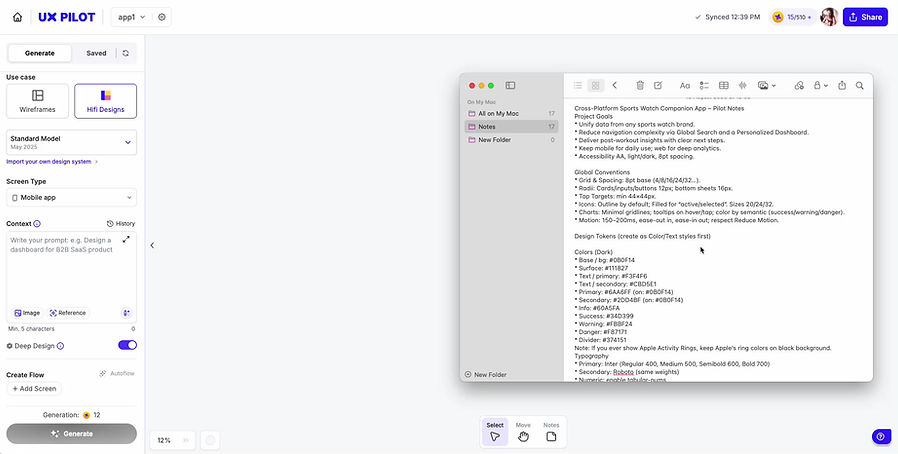
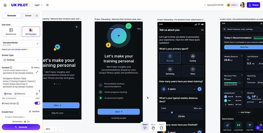
Before my design input, UX Pilot produced light-mode outputs directly based on the research findings
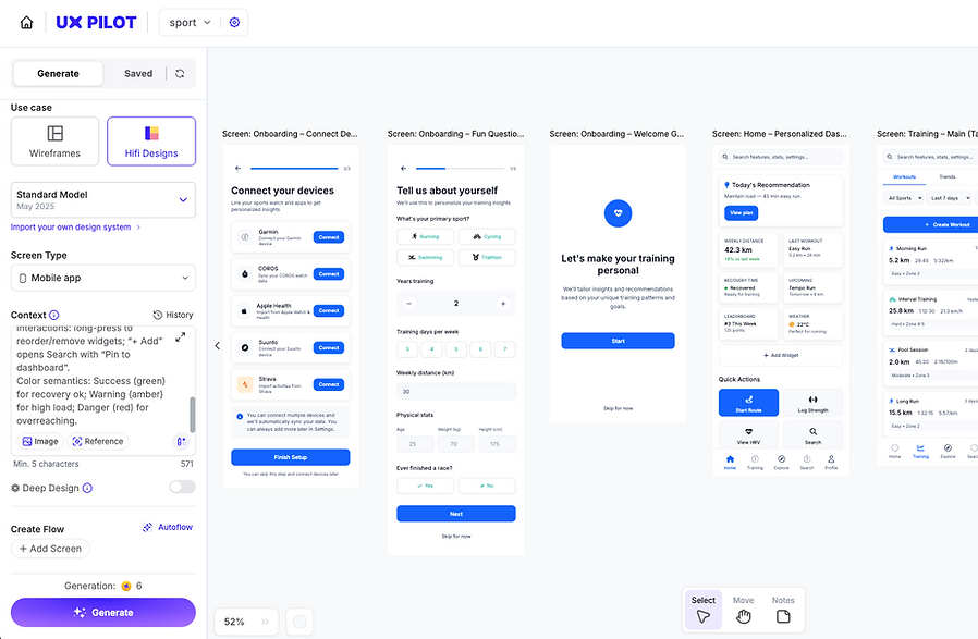
I chose the dark mode defined during the process for further work in Figma. These are the UX Pilot outputs prior to editing
Design Concept
Seamless transition from UX Pilot to Figma, ensuring research-driven guidelines are reflected in the final design
Summary & Key Takeaways
This self-initiated, time-boxed project focused primarily on research and early concept exploration for a cross-platform sports watch companion app.
I conducted extensive AI-powered market, user, and UI research, defined the app’s information architecture and navigation flow, and explored design directions through UX Pilot. Rather than delivering a complete flow, the goal was to present a high-level concept, supported by clear research, structured UX thinking, and initial design sketches that demonstrate the potential of the product.
What I Achieved
-
AI-powered market & user research
-
Clear problem framing & opportunity mapping
-
Defined information architecture & navigation principles
-
Competitive UI benchmarking & visual direction
-
Concept exploration in UX Pilot
-
Design concepts for key screens
What's Next?
Next Steps Toward a Final Product Following the research, UX Pilot outputs, and initial sketches in Figma, the process now moves toward refining the concept into a production-ready product. The focus is on polishing the design, validating usability, and preparing assets for development.
Process Ahead:
-
Design Refinement: Iterate on Figma sketches, finalize visual language, and adapt for desktop.
-
User Testing: Validate flows and usability with real users, refining based on feedback.
-
Design System Expansion: Build and document reusable components.
-
Specification & Handoff: Prepare detailed UX/UI specs and deliver organized assets for development.
-
QA & Iterations: Conduct graphic and functional QA, apply fixes, and finalize for release.